Practice · 4 min read
Interior design mood boards that clients understand
A mood board shows a client how a room will feel before anything is bought or built. The best ones are not collages of everything you like. They are a short, clear argument for one room.
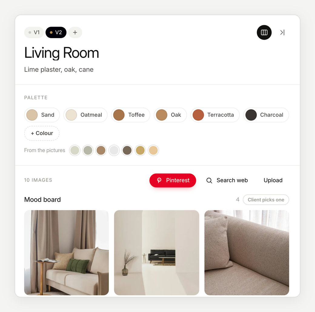
What a mood board is for
A mood board sets direction: the atmosphere, palette and materials of a space. It is not a shopping list. Make it clear which images are references for a feeling and which are pieces you actually intend to use, so nobody falls in love with a lamp that was only there for its light.
One board per room
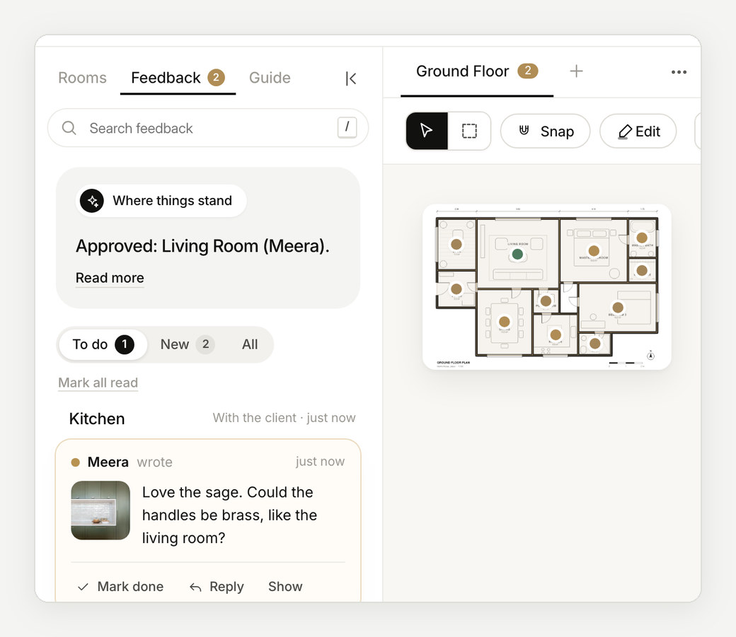
A single board for a whole home blurs everything together. Give each room its own board, and show where that room sits on the plan, so the client always knows which space they are looking at and how it connects to the next.
What to put on it
- Six to ten images, with one clear lead image for the room's idea.
- A palette of four to six colours, named.
- Materials and finishes: floor, walls, joinery, metal, fabric.
- Key pieces: the sofa, the bed, the light that defines the room.
- Light: how the room is lit by day and by night.
- One line of words that sums the room up.
Mood board, material board, concept board
| Mood board | The feeling of a space: images, palette and references. Early in the design. |
|---|---|
| Material board | The actual finishes and samples to be used: tiles, wood, stone, fabric, metal. Later, as choices firm up. |
| Concept board | The big idea of the whole project, often one per scheme, before rooms are worked out. |
On a project they follow one another: the concept sets the idea, mood boards develop it room by room, and material boards fix what will be built.
Building the palette
Pull the palette from the images rather than inventing it beside them: three to six colours that actually appear in the pictures. A common rule of thumb is 60-30-10: about sixty per cent of a room in a main colour, thirty in a second and ten in an accent. It's a starting point, not a law, but it stops a palette of six equal colours from feeling restless.
Name each colour in plain words, such as sand, oak, terracotta, rather than only codes. Clients remember names, and so will you in the next meeting.
What each room's board needs
- Living room: the seating and how it faces, the rug, light by day and by night, and one piece that gives the room its character.
- Kitchen: cabinet colour and finish, worktop, splashback, handles and taps, and how the open shelves will be styled.
- Bedroom: the bed and headboard, bedside lighting, fabrics, curtains and storage.
- Bathroom: tiles for floor and walls, the vanity, metal finish of the fittings, and the mirror and its light.
Mistakes to avoid
- Too many images, so the idea gets lost.
- Pieces that can't be bought or built, which clients then ask for.
- No difference between a reference and a real product.
- Cropping every image to the same square.
- One board for the whole home.
Layout that reads
Give the board a hierarchy: one large lead image, then supporting images, the palette and materials. Leave white space. Caption what matters. Keep pictures in their own proportions rather than cropping everything into squares, because a cropped image can change what a client thinks they saw.
Tools to make one
- Pinterest, for gathering references.
- Canva, Milanote, Photoshop or InDesign, for laying out a board by hand.
- Interior design platforms such as Programa or DesignFiles, if your work centres on sourcing products and invoicing.
- Enfilade, for a board on every room of the floor plan, shared with the client as one link they react to and approve.
Getting feedback the client can give
Ask what they love first, then what should change, and ask them to point at the image they mean. "Make it warmer" is hard to act on; a note on the exact rug is easy.
In practice
In Enfilade, every room on your plan has its own board. Clients heart the images they love and pin a note on the one that should change, from their phone, and approve the room when it is right.
Questions
How many images should an interior design mood board have?
Six to ten is enough for most rooms, with one clear lead image. More than that starts to hide the idea.
What is a material board in interior design?
A board of the actual finishes to be used, such as tiles, wood, stone, fabric and metal, usually made later than the mood board, once choices firm up.
Should a mood board be digital or physical?
Both have a place. Digital boards travel to every decision-maker and keep their history; physical samples are best for touch, colour and texture before final approval.
Keep reading
- Practice · 4 min readHow to present an interior design concept to a clientHow to structure and deliver an interior design presentation that wins client approvals: room by room, anchored to the floor plan, with zero confusion.→
- Practice · 3 min readThe interior design client brief: 40 questions to ask40 essential interior design client brief questions: lifestyle, aesthetics, room requirements, budget, and approval timelines. Free questionnaire.→
- Plans and drawings · 4 min readFloor plan symbols and what they meanA visual guide to architectural floor plan symbols: walls, doors, windows, stairs, electrical fixtures, plumbing, and standard plan abbreviations.→